• Portfolio
  • About Scott W. Gray
Menu

Fauna Writer | Scott W. Gray

copywriting and creative direction
  • Portfolio
  • About Scott W. Gray

OPG: Ontario Power Generation

The Project:

Complete overhaul of the existing OPG website and ecosystem, to create a single, unified web experience from disconnected microsites, campaigns, reports and white papers. Develop a new tone, manner and design and provide training for OPG to manage their platform internally.

— Created consistent site from disparate microsites, reports and campaigns

— Unified tone and design across all 7,000 pages

— Designed to be fully accessible

— Modular / CMS construction for client flexibility

— SEO, SEM and Keyword seeding


The Challenge:

As one of the largest energy producers in North America, our client needed a website that reflected their importance and financial significance for Ontario and Canada. However, years of policy updates, microsites, reports, related partner content and changing technology had created a web presence that was disconnected and disparate.

The Solution:

We proposed a complete overhaul of their existing site, an audit of all available content, as well as a direct shift in the site’s tone, design and audience stewardship.

I was engaged to develop the tone and manner, recommend creative directions, help content migration decisions (keep, cull, kill), impact search engine effectiveness, and develop new content streams to capture the client’s role in energy production, environmental initiatives and financial leadership.

I worked alongside an expert team to complete a site audit and develop a new site structure, recommend content changes, develop a new look, feel and tone for all creative elements, and shift the entire site to one that’s fully-responsive, fully-accessible, and uses a module-based CMS to make client- changes easier.

The Results:

In the end, the client launched their new site on-time, on-budget and with internal staff better-able to create content for today’s audiences, while conveying newly reworked communication points.

My Role in this Project:

For this project, my role built on my digital expertise, and included developing a full editorial plan for all existing content, rebuilding the search engine optimization of the new site, creating content examples and templates for writers, coaching them on best-practices, all toward developing a single, consistent, contemporary site for our client.


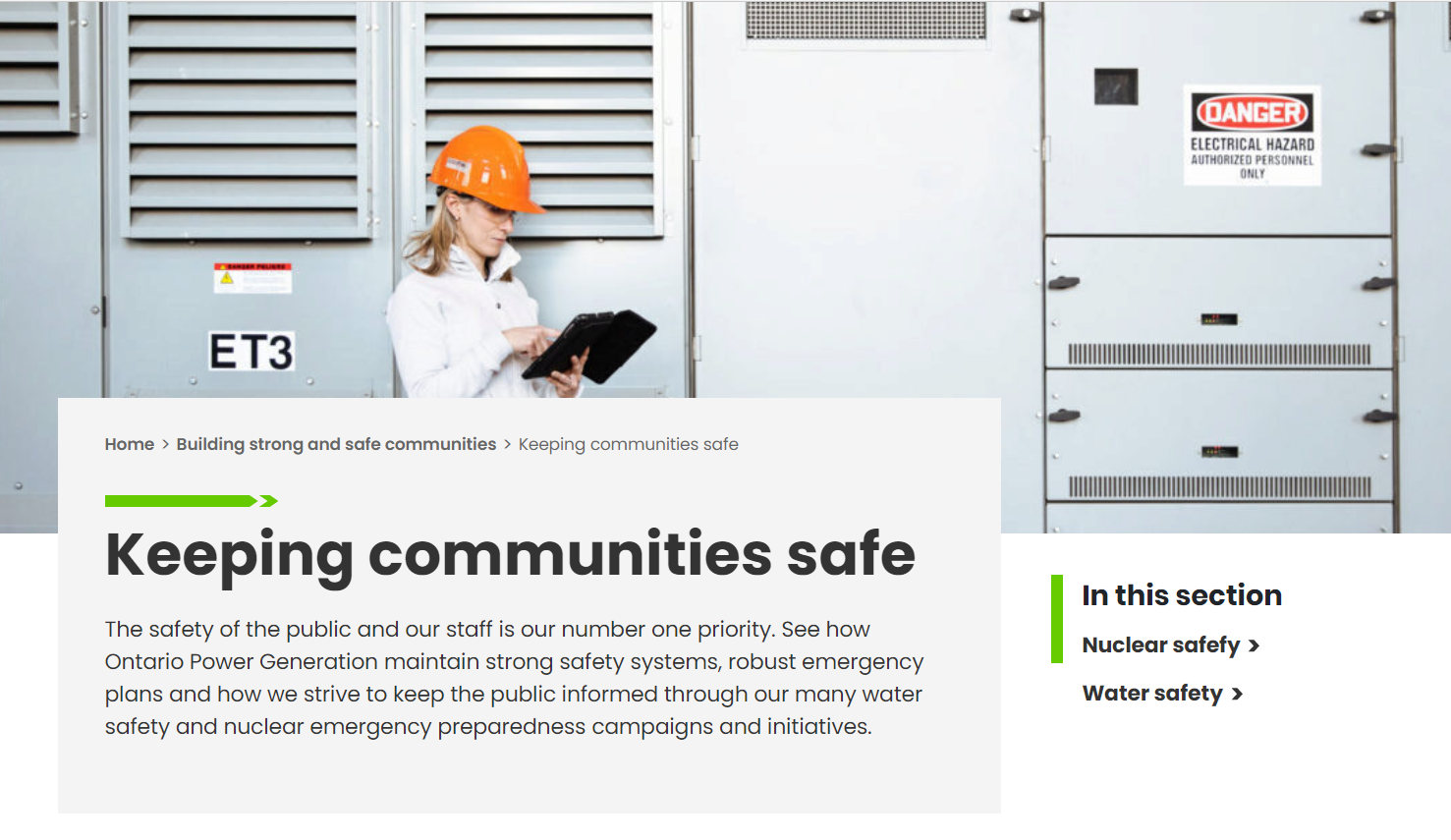
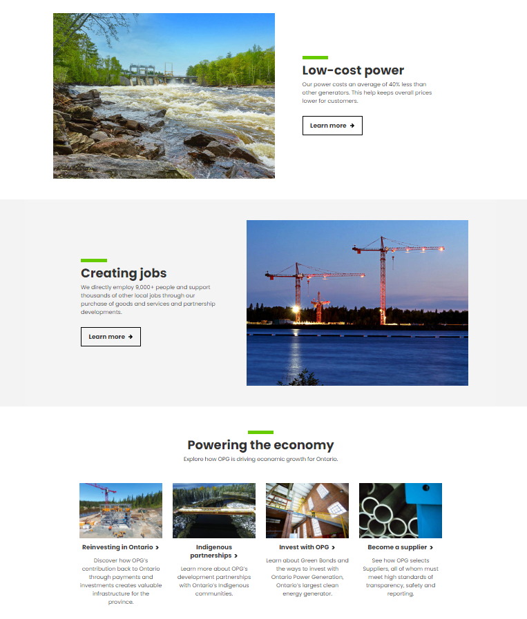
   New guidelines prioritize punchy copy, short blocks and clean, clear design.

New guidelines prioritize punchy copy, short blocks and clean, clear design.

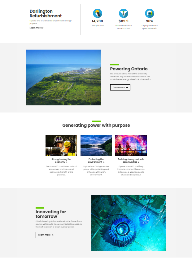
   Our modular design allows more white space and consistent layout throughout.

Our modular design allows more white space and consistent layout throughout.

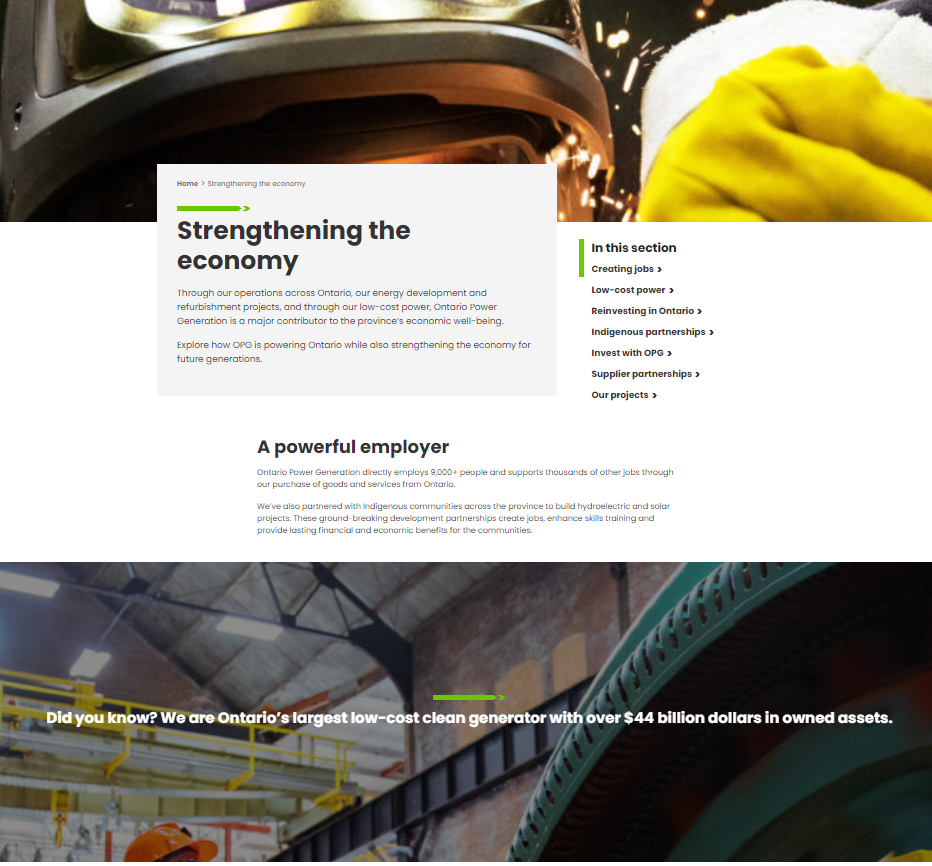
   Full-bleed images break up page flow, so audiences find info they need.

Full-bleed images break up page flow, so audiences find info they need.

  No dead ends:  all pages connect audiences to more info and relevant content.

No dead ends: all pages connect audiences to more info and relevant content.

UNICEF: Global

The Project:

Re-imagine the entire UNICEF Global online platform, to create one consistent, contemporary web experience from a series of outdated microsites, reports and campaigns. Take 70,000 web pages and maintain creative consistency and full accessibility across 5 languages.

— Global digital platform

— 70,000 unique web pages

— Fully-responsive

— AA-Accessibility standard

— Deployed in 5 languages

— Fully responsive

— CMS backend


The Challenge:

As the global leader in emergency aid provided to the world’s most-needy children, our client was well known – but had an identity crisis.

Despite being top of mind for the quality care and commitment they show for the world’s children, they had a digital presence that was behind the times.

It was disparate, disconnected, out of date and frustrating to navigate. As well, content for academics and policy makers was indistinguishable from public-facing articles and photo essays, as the same arms-length tone was used throughout.

The Solution:

We established a brand language for our client, bringing a variety of content types together in simpler and more elegant ways, bridging dead-ends for users, and changing the focus of the global platform from one that speaks at an audience, to one that speaks to – or even with – them.

Our redesign included bolder use of photography, contemporary language, more useful data-visualization, as well as first-person narratives, and easy-to-access reports that underpin everything our client does for children. We strove to make the new global site as effective and as respected as the work our client does on the ground, and make it personally relevant to each visitor.

Our timing couldn’t have been better, as the platform introduced the client’s new brand tagline and positioning, and also celebrated their 70th anniversary as a UN organization.

The Results:

Facing the worst humanitarian crisis since the organization launched, we gave our client the digital tools to empower audiences and their own organization in the fight for the rights of children.

We created templates, multi-use components and design and copy standards for each section of their organization, including Country Offices and Regional Headquarters, who have diverse and unique needs.

By the end of the design phase of the project, we had given an international client the platform they needed to take on contemporary, global issues, in a way that both reflected the world and their audience.

My Role in this Project:

For this project I led the creative team, from concept through execution, stewarding the client through multiple design phases. I created the platform tone and manner guidelines, wrote an extensive amount of copy, led the design standards, and collaborated with UX and Tech directors from both internal and external organizations.

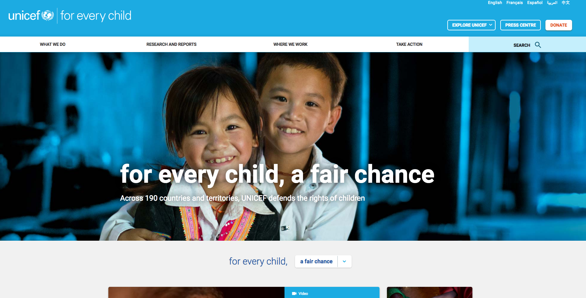
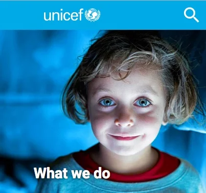
   Our homepage employs a pull-down menu, to help audiences serve up content they seek most.

Our homepage employs a pull-down menu, to help audiences serve up content they seek most.

   Full-bleed images help anchor audiences on each page, with relevant, curated below.

Full-bleed images help anchor audiences on each page, with relevant, curated below.

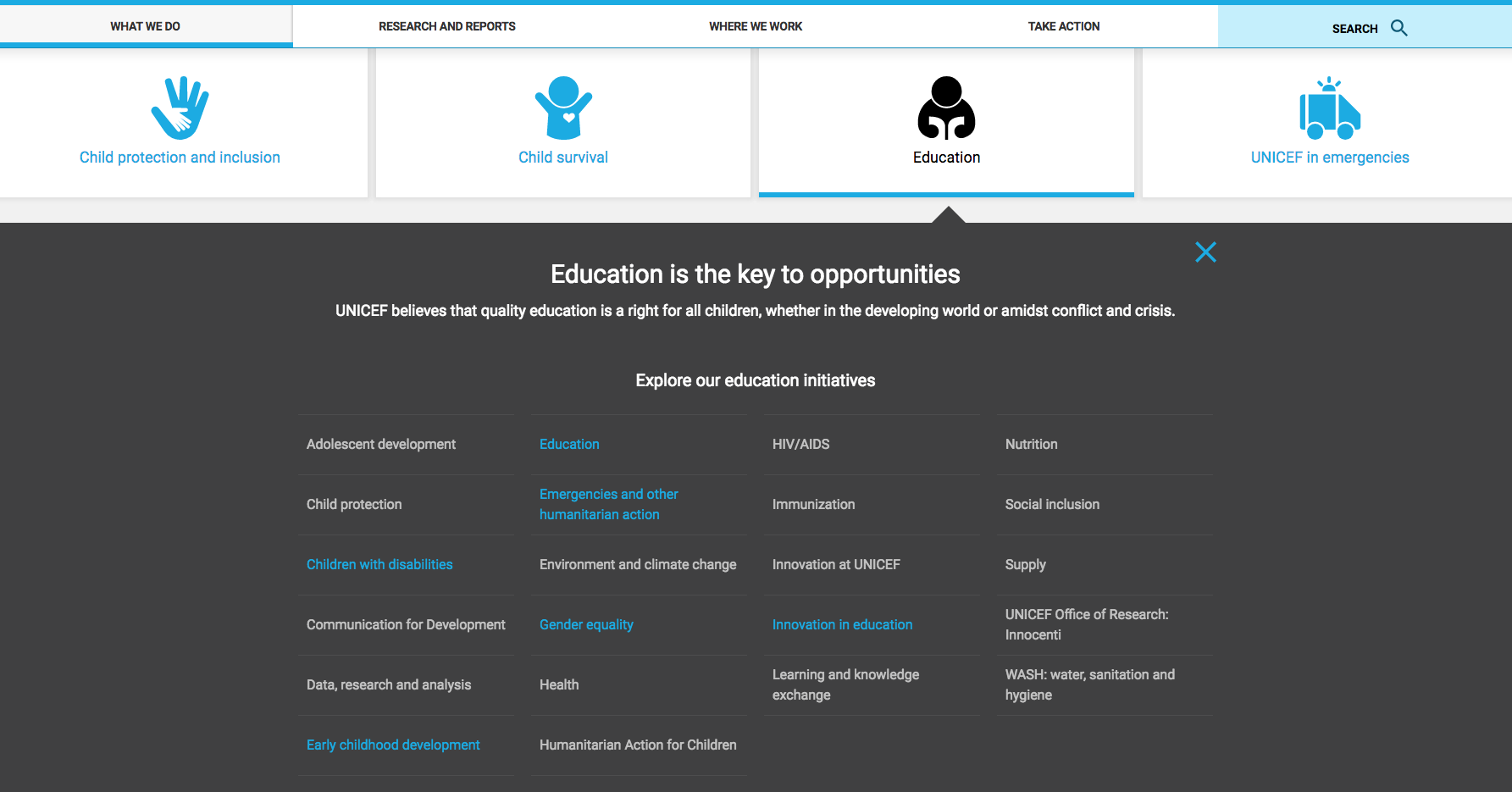
   Icons, drawers and modules allow deep levels of information to be easily scanned.

Icons, drawers and modules allow deep levels of information to be easily scanned.

   Pages prioritize UNICEF’s mission: helping children around the world.

Pages prioritize UNICEF’s mission: helping children around the world.

adidas: Avenue A

The Project:

Create a curator-led sports clothing subscription program for adidas, aimed at women runners, without advertising or media spend. Develop the entire platform, campaign, digital experience, path to purchase and packaging for an innovative new test program.

— adidas’ first-ever online subscription program

— No paid media support

— Influencer-driven campaign

— Digital experience, packaging, social and eCRM creative


The Challenge:

Our client wanted to re-establish its notoriety with women runners across North America by launching a fitness apparel subscription service in an already highly competitive market.

They also wanted to do this without any paid media support. So, no pressure, right?

We were therefore tasked with a tricky challenge – invent and launch a brand new product and new way to access customers, without any traditional means of growing awareness.

With this in mind, we developed Avenue A from the ground up. The name, identity and physical packaging, as well as the positioning and go-to-market strategy, were created to bring a new product to market and create an entirely new brand.

The Solution:

Every aspect of Avenue A embodies transformation – from the stunning visual elements of the launch video, to the motivational design used to encourage consumers through their path to purchase.

Our video introduced our program to the masses. With Avenue A’s sleek black box front and centre, you run as the city wakes. Along the way, you engage with the surroundings and realize an enhanced world exists within Avenue A – where lights and colours dance across the sky, animals leap forward, and pavement lines pulse to your pace.

Our video features this layer on the world through animation, motion graphics and design effects.

As you run, seasons pass and Avenue A’s enhanced view evolves: butterflies and whales emerge from steel beams and concrete paths, lighthouses illuminate city streets, colour and fireworks spark across darkened streets, helping audiences shape their own way forward – just like Avenue A.

The best part of the program? Each box is curated by a celebrity influencer – Olympic gold-medalist and soccer phenom Morgan Brian, superstar-celebrity trainers like Nicole Winhoffer, or internationally respected singer, entrepreneur and actress Rita Ora.

The curation process – including photo and video shoots – helped our celebrity Influencers’ personalities shine through. For every box, a steady stream of unique and engaging content shared across digital channels featured each curator’s fashion, fitness, and motivation inspirations.

The Results:

Consumers are celebrating Avenue A on social media, asking questions, sharing photos, singing our praises, shouting out to their friends – even hanging our packaging on their walls.

Avenue A has transformed our client’s product rollout, as subscribers receive premium, curated apparel and footwear before they hit stores, which has enhanced their apparel launch schedules.

The Awards:

Avenue A was honoured with 3 Canadian Marketing Awards for innovations in consumer engagement and digital retail.

My Role in this Project:

For Avenue A, I was responsible for concept through execution, developing the product name, product rollout, all copy and eCRM extensions, all videos, input on curator selections, musical development, eCom, social and packaging.

   Clean, contemporary and cool, no matter the device.

Clean, contemporary and cool, no matter the device.

WATCH: adidas Avenue A - a transformative experience

   Fabulous celebrity influencers and fantastic photography upped the cachet

Fabulous celebrity influencers and fantastic photography upped the cachet

   All items were Curator-chosen and high end, from the top down!

All items were Curator-chosen and high end, from the top down!

Canadian Marketing Awards: Honours

I’m very pleased to say that adidas Avenue A won several prizes at the 2017 Canadian Marketing Awards.

The team I co-led was honoured with a Silver Award in Community Engagement: Retail, as well as another Silver Award in Digital Retail. We also achieved a Bronze Award for Community Engagement: Consumer Products.

I was involved in Avenue A at nearly every creative level from inception to launch over two fiscal years, so it was extremely gratifying to win this award with my very talented, semi-genius colleagues and partners.

CMA_Number1.jpg
Screen-Shot-2018-06-18-at-12.59.35-PM.png

DFC: Fuelling Women Champions

The Project:

An innovative, multi-year campaign for Dairy Farmers of Canada, designed to boost public perception of the brand, and give back to Canadian communities by helping amateur female athletes succeed at every level.

— Year One: Creating content and awareness campaign

— Year Two: Building grant-giving empowerment program

— Multisport, multilingual, professional and amateur

— Unique campaign of sports and social activism


The Challenge:

Our client wanted to reinforce their involvement in communities across the country, and decided to align with Canada’s women athletes, and their lack of mainstream sports representation.

The Solution:

We built a multi-year, multi-platform campaign that ranged from short, inspiring videos to long-form articles, quick gifs on social to grant-giving awards online, all to empower Canada’s women athletes.

Year One of the project involved content marketing. We established an editorial calendar and publishing cadence across web and social media to engage audiences, and to highlight the challenges that our elite female athletes face. We created articles, videos, long-form interviews with our FWC Ambassadors (Olympians and professional female athletes from a range of sports), as well as young women athletes and their families from coast to coast.

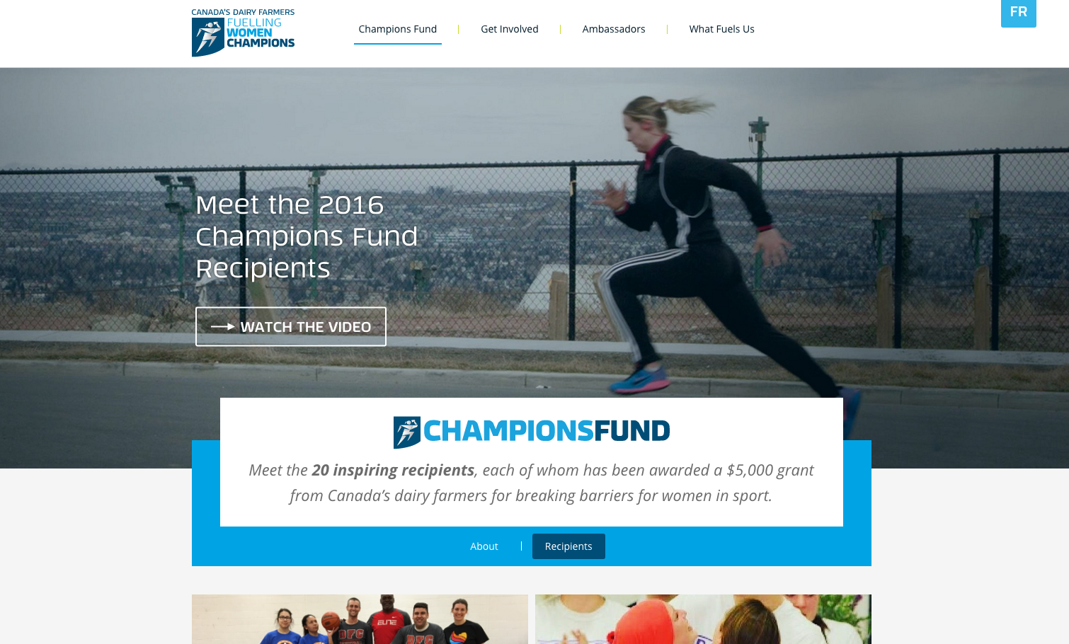
Year Two of FWC took awareness forward into advocacy, offering amateur women athletes and sports organizations a chance at 20 grants of $5,000 each. We knew from research that a grant of this amount could create the difference in an amateur athlete’s career – literally offering a young woman a chance to travel to tournaments, hire a personal trainer, upgrade equipment, or fund their chance at Provincial or National competitions.

The Results:

Fuelling Women Champions had many successes. Highlighting the gross discrepancies between the media coverage and funding available to male and female athletes in a year when Canada’s women qualified for major international competitions in rugby, basketball and soccer helped build affinity with Canadians. Seeing this uneven playing field helped set up the success of FWC in Year Two, when women could apply for and access the kinds of funding that make a real difference in a young athlete’s progress.

The campaign radically over-performed for our client, pushing past projections in Year Two and creating the case for an ongoing alignment in sports for DFC.

My Role in this Project:

For FWC, I was involved in both years of the campaign as a Senior Copywriter, from concepting and writing web- and social- copy, as well as doing interviews, writing articles, traveling to cover sporting events, and shooting photos and videos of events. In both annual phases, I was involved in the AI, determining the content that would be net-new, what could be adapted, and what would need to live on as evergreen content.

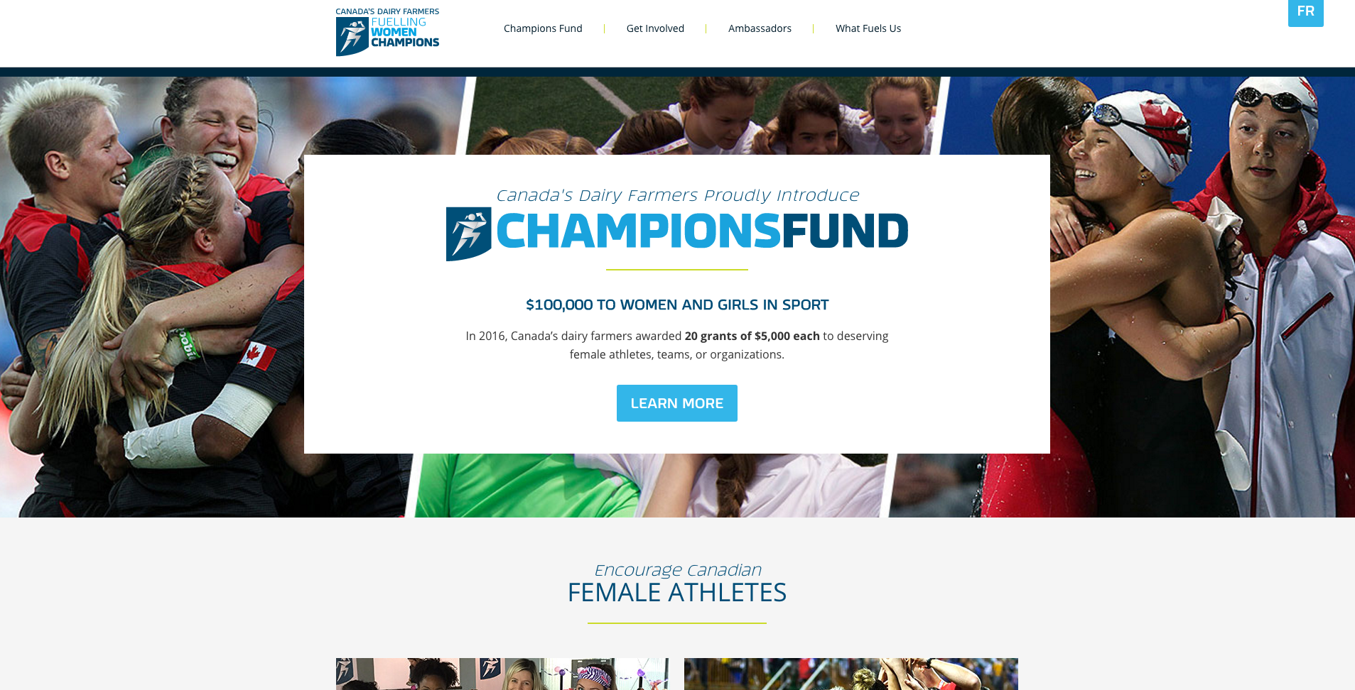
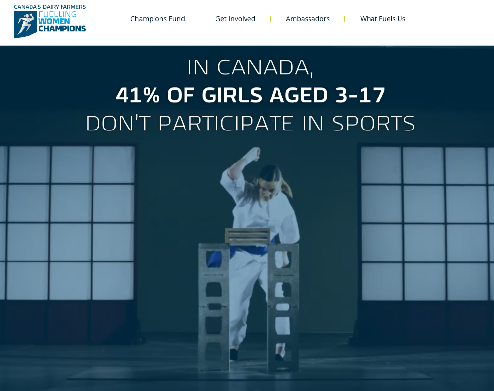
   We focused on inspiration and support for young female athletes across Canada.

We focused on inspiration and support for young female athletes across Canada.

   Imagery and statistics show how women can break through stereotypes and succeed.

Imagery and statistics show how women can break through stereotypes and succeed.

   Amateur athletes are celebrated and supported online, financially, and through events and training.
Amateur athletes are celebrated and supported online, financially, and through events and training.

Investors Group: The Plan

The Project:

A copy-centric series of webpages, stewarding clients having personal or professional crises toward optimum insurance packages.

— Landing pages focused on life challenges

— Compassionate outreach for client’s program

— Part of a series to drive engagement


The Background and the Challenge:

When Investors Group approached us about marketing The Plan, their full-life-cycle, full-service insurance program, I had just experienced a series of devastating deaths in my immediate family.

As strange as it might sound, I asked to work on the client’s materials surrounding Divorce, Loss of a Loved One, Starting a Business and Advice for New Canadians, because I felt like I could offer a perspective and a tone from first-hand experience.

The Solution:

We knew the audience would probably only be looking for information on these topics when emotionally-exhausting situations were already under way. So what we created involved wide-open spaces, reassuring but realistic copy, and tools to help people find an agent in their area to talk to directly. I used my recent experience to craft the copy and steward the strategy around the content.

The Results:

While perhaps not the most ground-breaking campaign ever developed (and again, I say perhaps), these materials hit upon a tone that we found missing in other materials in the sector – one that didn’t over-promise optimism, but did promise options. I knew it would work, and the client saw that it did, because the messaging came from a genuine, compassionate and helpful place.

My Role in this Project:

For this campaign I was responsible for the concept through to the copy, the support copy for the tools and online display advertising.

   Copy focused on recognizing the challenges, and seeking support to manage them.

Copy focused on recognizing the challenges, and seeking support to manage them.

   Our campaign focused on providing options and solutions when clients need them most.

Our campaign focused on providing options and solutions when clients need them most.

   Audiences saw themselves reflected in the creative, which changed the overall perception of our client.

Audiences saw themselves reflected in the creative, which changed the overall perception of our client.

TD Million Dollar Retirement

The Project:

Inspire Canadians to begin saving for retirement by providing the information and tools necessary to start a practical retirement savings plan with TD Canada Trust.

— Digital campaign including website, video, online tools, and media

— Designed to access younger market in new ways

— Successfully built bridges to audiences across major touchpoints for client


The Challenge:

Getting people to start saving for retirement when they’re still young is a tall order. Unless you ask them if they want to retire as a millionaire.

Statistics showed us that the average Canadian would need about a million dollars by retirement age to retire comfortably.

The Solution:

We used this fact as the anchor for a digital campaign that included video, expandable banners on YouTube, a calculator tool, social media posts and various display ads, all reinforcing the ways you can start saving small amounts toward your Million Dollar Retirement.

The Results:

The information was clean, the tools were useful, and the client was happy with the results, expanding the program in subsequent years.

My Role in this Project:

For this project I was responsible for the concept through to the copy, the scripts, calculator support copy and all the display media.

   Videos, tools and web content helped audiences understand the need to start saving for retirement.

Videos, tools and web content helped audiences understand the need to start saving for retirement.

   Helpful calculators reflected audience inputs, and offered tips and tricks to increase savings.

Helpful calculators reflected audience inputs, and offered tips and tricks to increase savings.

   Flexible tools allowed audiences to input personal details to see what specific savings could be.

Flexible tools allowed audiences to input personal details to see what specific savings could be.

DFC: Get Enough Video Project

The Project:

Raise awareness about dairy’s role in combating colorectal cancer and create the connection for audiences between Dairy Farmers of Canada and the charitable causes they support.

— National campaign

— High-impact, high-concept video

— Integrated messaging

— Digital and theatrical deployment


The Challenge:

We were tasked with finding a way to tell Canadian audiences about the preventative health benefits of dairy – specifically, how it helps in the fight against colorectal cancer.

We knew all the challenges around this narrative, and we also knew we wanted to create something that surprised audiences, was visually captivating, and revealed what could be new information to them in a new way.

We had already launched an app that helped people track what they eat, and with each use generated donations to worthy Canadian health charities.

So we attacked the challenge metaphorically.

The Solution:

We launched a highly conceptual video online, across social media, and in movie theatres across the country to make audiences take notice of our message.

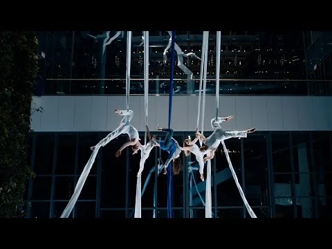
Our video showed the confusion of health crises in a dramatic way, creating a narrative where a woman is literally swept off her feet and left hanging by dark ribbons that represent colorectal cancer. She is surrounded by competing demands for her attention, pulled in various ways by actors and forces outside her control, until she is finally able to regain her equilibrium and return gracefully to solid ground. We brought the white ribbon logo of the Canadian Colorectal Cancer Society into view with our messaging on the final frames to create contrast with the ribbons that swept our actor up.

The video included original music and choreography. Aerialists brought a rugged physicality to the video, juxtaposing elegance and explosive power in a way that mirrors a serious health crisis.

The Results:

Our client was floored by the finished product and overjoyed with the results. App downloads and donations increased, awareness was raised inside our target audience. But more critically, a new way to explore dairy’s health benefits became available and proven successful.

My Role in this Project:

For this project I was responsible for the concept through copy, collaborating on the choreography, music, visual direction, and promotional executions.

WATCH: Get Enough - The Surprising Benefits of Milk

   Aerialists use the Blue Ribbon of Colorectal Cancer Awareness in their choreography.

Aerialists use the Blue Ribbon of Colorectal Cancer Awareness in their choreography.

   The high-wire drama of cancer is explored metaphorically.

The high-wire drama of cancer is explored metaphorically.

   Statistics in the video, online media and website helped show audiences the health benefits of dairy, and DFC’s commitment to social issues.

Statistics in the video, online media and website helped show audiences the health benefits of dairy, and DFC’s commitment to social issues.

Montreal Canadiens: Mobile App

The Project:

Re-imagine the mobile app for the most-famous hockey team in the world, making it more user-friendly, fan-focused, and developing areas for sponsorship and partnership opportunities, without alienating Habs fans.

— Only team app allowed by league, not using NHL template

— Native / mobile hybrid

— Most-popular free sports app in Canada


The Challenge:

Our client was the most-storied and possibly most-popular NHL team in existence, but they felt they had three major problems: their mobile app didn’t reflect their stature, satisfy their stats-hungry fans, or give them enough sponsorship opportunities.

The Solution:

We concepted out an app that would balance the numbers with natural flow, and created spaces for their team’s character and sponsors to breathe.

The app was built in modules, to allow creative, cross-platform expansion in subsequent phases. While the original phase of the app included the must-haves for a sports-team app, subsequent phases include ideas that no sports team has explored yet, all working to bring fans an experience as close to the on-ice action as possible.

The Results:

Despite being given a timeline of only a few months we brought the full app to life for both iOS and Android, giving the team, fans and advertisers what they wanted.

With player card profiles, news and trivia, social-media tools, a simple season-long hockey pool and a radically improved navigation experience with full-bleed, large-scale photos, we found intuitive ways to keep fans engaged.

And by dedicating instructional and directional spaces for sponsors, we gave advertisers prime real estate in ways that fans would not resent or find obtrusive. Which was a win-win.

My Role in this Project:

For this project I was responsible for the concept through to the copy, the content mapping, a significant amount of technical copy, all notification and pool copy, app-store copy and related support copy.  

   The new app focused on large, engaging images, punchy copy and icons, creating a better experience.

The new app focused on large, engaging images, punchy copy and icons, creating a better experience.

   Game Day details were reworked to be cleaner, more-relevant and updated in real time during games.

Game Day details were reworked to be cleaner, more-relevant and updated in real time during games.

   In-App experiences like the 5-Pick Pool kept audiences engaged, returning to the App all-season long.

In-App experiences like the 5-Pick Pool kept audiences engaged, returning to the App all-season long.

DFC: Milk Calendar Pre-Rolls

The Project:

Inject new life into Dairy Farmers of Canada’s annual recipe campaign, and improve audience engagement with DFC across social media.

— Video pre-rolls and banners

— Unexpected execution

— Leveraging insights and motifs from pop-culture


The Challenge:

Our client wanted to drive awareness of their new recipe videos – all featuring Canadian dairy – that were tied to their annual print calendar.

In looking at what was already in-market, we decided that our target was probably already inundated with straightforward recipe video promotions, so we opted for a different path to gain awareness.

The Solution:

We took each recipe video, edited them down, and created fake film trailers that positioned the recipe ingredients as key players in archetypal movie genres. We made sure each trailer created a little narrative, and carried blockbuster-levels of food beauty shots to drive the deliciousness of each recipe home.

Over three years we promoted chocolate cake like a Hollywood romance, shepherd’s pie like a spy thriller, mac & cheese like a western, and a host of other absurdities. We had fun with ratings systems, music choices and – once – with subtitles in Klingon.

As well, we supported the pre-rolls with companion units that read like movie reviews, but on closer inspection, were actually statements about the quality of the recipe from the family members that enjoyed it.

The Results:

The results were pretty remarkable. Response was 300% higher than client expectation, and helped change the marketing strategy for recipe videos in subsequent years.  

My Role in this Project:

For this campaign I was responsible for the concept through to the copy, the display media executions, and all related social media posts. As well, I worked closely with my art director for all musical choices and genre-specific touches.

   We made fake movie trailers to engage over-saturated audiences in recipe videos.

We made fake movie trailers to engage over-saturated audiences in recipe videos.

   Different film genres were explored, from Action to Westerns to Rom-Coms, using tropes from each in our pre-rolls.

Different film genres were explored, from Action to Westerns to Rom-Coms, using tropes from each in our pre-rolls.

   Music, copy and design all built on movie shorthand, offering audiences a witty take on recipe videos.

Music, copy and design all built on movie shorthand, offering audiences a witty take on recipe videos.

   End-frames drove audiences to discover the recipes, and share them with friends.

End-frames drove audiences to discover the recipes, and share them with friends.

   The campaign was so successful, it changed how our client created and marketed recipe videos.

The campaign was so successful, it changed how our client created and marketed recipe videos.

prev / next
Back to Copywriting Portfolio
opg-home-1.jpg
4
OPG: Ontario Power Generation
Screen-Shot-2017-04-20-at-1.57.01-PM.jpg
4
UNICEF: Global
ADI-Ave-A-aveA.png
4
adidas: Avenue A
durex-2.png
0
Durex Duration
20161110_C6444_PHOTO_EN_814762.jpg
2
Canadian Marketing Awards Honours
b52-4.png
0
B52 Fit
dfc-fwc-3.jpg
3
DFC: Fuelling Women Champions
ig-2.jpg
3
Investors Group: The Plan
td-logo-1.png
3
TD Million Dollar Retirement
DFC-Ribbons-GET+ENOUGH.png
4
DFC: Get Enough Video Project
Screenshot_2014-03-16-20-32-56.png
3
Montreal Canadiens: Mobile App
dfc-milk-cal-1.jpg
5
DFC: Milk Calendar Pre-Rolls
olumiant-bro-1.PNG
0
Olumiant

Powered by Squarespace